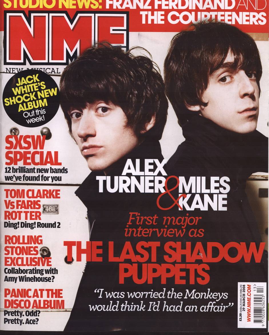
Masthead: NME – Brand name, well recognized music magazine Red, white and black coloured font (colours normally associated with music magazines).
Main Coverline: “The Last Shadow Puppet”. Links into the main image which is a photo of both band members (Alex Turner & Miles Kane).
Main Image: Both people are dressed to look as though they are in a band, or how people perceive these types of people to look for this specific genre of music. Photo is a low angle medium studio shot, which creates a connection to the audience and the main image, allowing them to identify with the type of genre portrayed.
Pug – promotion for Album, form of titillation.
Coverlines: Other supplementary information comparative to either the main coverline or music associated with this type of genre portrayed in the main image.
 |
Main Coverline/ Coverlines: There doesn't appear to be a main coverline, just a lot of coverlines, which could signify how all the stories are equally important, however certain coverlines and larger and bolder.
 |
Masthead: Vogue.It entices
the reader by drawing in their attention. Because of the mastheads familiarity
and affluence associated with it, the word, font and size of the masthead has
become well known. The masthead is well known so they use an actress (main image) who is equally as well known to draw in more readers. As well as this, since the title is covered slightly by the actress it shows that the magazine is well established and just as well known as her, if not more so, so it doesn't need to be seen. The layout is also well known, so people will know what the magazine is, even if the title is hidden.
Main Image and Main Coverline: "Holiday Romance" the colours used are eye catching yet nonchalant. The red dress she wears relates to both Christmas and passion, which reflects on the main coverline. The actress in the main image shows confidence and portrays sex appeal and beauty. This may make other woman want to buy the magazine so they can be like her.
Coverlines: May appeal to woman who don't have a lot of money and can "Invest" in something that may not cost a lot but still make them feel as if they've spent a lot of money.
|

No comments:
Post a Comment