Sunday, 25 November 2012
Cover and Contents Page Powerpoint
<iframe src="http://www.slideshare.net/slideshow/embed_code/15342569" width="427" height="356" frameborder="0" marginwidth="0" marginheight="0" scrolling="no" style="border:1px solid #CCC;border-width:1px 1px 0;margin-bottom:5px" allowfullscreen webkitallowfullscreen mozallowfullscreen> </iframe> <div style="margin-bottom:5px"> <strong> <a href="http://www.slideshare.net/TomAshby/cover-and-contents-page" title="Cover and contents page" target="_blank">Cover and contents page</a> </strong> from <strong><a href="http://www.slideshare.net/TomAshby" target="_blank">TomAshby</a></strong> </div>
Monday, 12 November 2012

Music Magazine Covers
Music
Magazine Covers
The Image
·
If there is a person/group on the cover, what
do they represent? – What do your pictures/ people represent? (Should reflect
the people or read the magazine)
·
Are they a stereotype?
·
How has this stereotype been constructed? – possibly
challenge stereotype
·
Special effects and/ or props – everything has
been posed
The Gaze
·
The Gaze refers to the direction in which the
person on the cover is looking
·
Are they looking straight at the audience?
·
Are they smiling – enticing the reader in?
·
Do they look friendly or cool?
·
Do they look seductive?
Notes
·
No image can contain more than five models
·
Aloud to use real bands
·
Need images for cover, contents page and
double page spread
The
Mission Statement
·
Explain what kind of music magazine you hope
to create by focusing on genre and style.
·
Explain the audience that you are trying to
target.
·
Give a brief overview of the content of your
magazine.
·
Explain the role that you think your magazine
will play in the lives of its readers.
Monday, 5 November 2012

Sunday, 4 November 2012
Which Genre?
After researching different types of music
magazines I have come to the conclusion that for my music magazine I will do a grunge/punk
magazine. I have chosen to this genre, as the music is more applicable to
people my age and the target audience I want to aim at. As well as this there are a few magazines pre-existing
so there is more room to be original and creative with my design. Although
there are limited magazines there are still some which I can use as a template
for my magazine. Magazines such as Kerrang, NME and Punk are all magazines
similar to the mode I want to achieve. The style and layout of these magazines
also represent the genre well and make it clear what type of magazine it is.


The Contents Page
1. What is the function of a contents page?
The design for a contents page in a magazine is analogous in the sense that they all follow similar layouts. All three examples I have selected are magazines, which target different audiences, yet have similar layouts and designs when it comes to the contents page. This is because readers are familiar with “traditional” type of contents page, so by using similar designs, i.e. images from the features, summaries, revealing text and page numbers, it allows the reader to quickly select articles they want to read.
Different contents pages normally display different amounts of information. The examples I have chosen present the titles of the features, as well as other relative information, such as promotional information, page numbers. Normally the contents page shows notes by the contributors to the magazine, highlighting key articles and their own opinions. The GQ Sport shows images of the “contributors” as well as three different mini articles from them.
The contents page contains information on articles (summary), promotional offers, page numbers, images related to features.
Images are used to compose the reader to want to read the article through the use of titillation and by using altering/ disturbing imagery correlated with the features in the magazine, empathizing their importance. The images used in Vogue are pertinent to the type of magazine Vogue is; a fashion magazine. They promote the clothing yet show only a diminutive sample of the items. They are also used to influence the reader into believing these images are the new “in” item to wear, making them want to buy these items.
Language is used to make the reader want to read the article through the use of alliteration, titillation, controversy and applicable articles. Language is also used to endorse the articles featured in the magazine. Slogans can be used as well as sharp humour, such as satires and double entendre’s; normally the jokes are aims disjointedly or even observably at celebrities or political figures, depending on the genre of the magazine.
To make the contents easy to read, the contents page the layout and design must work together, or else the reader will become perplexed and incapable to comprehend the contents page. The contents page needs to display the right information, such as page numbers and short titles. The contents page must allow the reader to identify definite stories that they would find interesting.
The function of a contents page is to show the reader the entire list of articles that are featured in the magazine. This helps the reader to find certain articles which appeals to them more, as well as showing the analogous page numbers, which further aids the reader.
2. How does a reader use a contents page?
Since the contents page is located at the front of the magazine it is easy for the reader to use, which they can then use to browse and select features they find interesting. The contents pages use titillation to appeal to the reader. They normally recapitulate the article in a summarized title, allowing the reader to have a clear idea of what they might read.
 |
| Hammer Contents Page |
3. What is the conventional layout for a contents page in a magazine?
Contents pages in magazines usually follow the same layout and structure of the magazine. The typical structure of a context page is a grid structure, displaying coverlines, page numbers and various images relevant to certain features.
For example the magazine ‘Hammer’ uses red, white and black, colours normally associated with this genre of music. The font of the context page uses similar colours, reflecting on the type of genre of the magazine (heavy metal). A reason for using these colours is that people presume heavy metal is dark, baleful, and in some cases evil so by using these it could possibly play on this stereotype, whilst still appealing to the readers. The layout is set up as 2 sides, with some headlines on the left hand side of the page and picture headlines on the right, as well as the bottom. The use of pictures on the content page allows the reader to easily identify the music genre. |
| Vogue Contents Page |
 |
| GQ Sport Contents Page |
4. What is the conventional design for a contents page in a magazine?
5. How much information does a contents page contain?
Different contents pages normally display different amounts of information. The examples I have chosen present the titles of the features, as well as other relative information, such as promotional information, page numbers. Normally the contents page shows notes by the contributors to the magazine, highlighting key articles and their own opinions. The GQ Sport shows images of the “contributors” as well as three different mini articles from them.
6. What information does a contents page contain?
The contents page contains information on articles (summary), promotional offers, page numbers, images related to features.
7. How are images used in a conventional contents page?
Images are used to compose the reader to want to read the article through the use of titillation and by using altering/ disturbing imagery correlated with the features in the magazine, empathizing their importance. The images used in Vogue are pertinent to the type of magazine Vogue is; a fashion magazine. They promote the clothing yet show only a diminutive sample of the items. They are also used to influence the reader into believing these images are the new “in” item to wear, making them want to buy these items.
8. How is language used in a conventional contents page?
10. How does the function of a contents page affect its layout and design?
Tuesday, 16 October 2012
School Magazine Example 3

This is the third draft of my school magazine front cover. For my main image I took a photo of a female with the words “Youth” written on a white board. I did this because the magazine is going to focus primarily around adolescent problems and celebrating being young. For the font of the masthead and coverlines I used the colours white and black to make it seem proficient yet salubrious.
Thursday, 11 October 2012

Monday, 8 October 2012
Homework 8/10/12
Homework
Create the necessary images for your front cover by Monday 15th October. Must include one medium shot of a student. Three images at the most.
School Magazine Cover Example 1

This is the first draft of my school magazine front cover. To make it I used the software “InDesign”. While creating the masthead I used primary colours to make it appear more prominent, as well as using colours which epitomize the school logo and uniform of the students. This makes the magazine more relatable to students by using acquainted colours they associate with school and education.
As well as this I made the font larger than the supplementary coverlines, and used the font “Myriad Pro” to make it appear more proficient and specialized, reflecting on the type of individuals that would read the magazine.
Class Work 8/10/12
Using Indesign
1. Create a new document – A4
2. Show document grid
3. Use rectangle frame tool
4. Use type tool
5. Select font
6. Change text size
7. Use colour picker
8. Create text effects using the Stroke function
9. Use layers
10. Import an image using Adobe Bridge
11. Change image size
12. Crop an image
Sunday, 7 October 2012
Questionnaire Evaluation
Questionnaire Evaluation
For my questionnaire i have chosen to do eight questions, some of which were quantitative and others qualitative. I have done this so my results would be more valid and reliable. This would also allow me to generalize and stratify my final results. By doing this i would be able to see where trends appeared so i could focus more around those areas when designing my final draft of my front cover. The questions i asked would also show which gender preferred different design ideas, so i could then use the results to make the magazine appeal to both types of reader. By asking qualitative questions i would be aloud to gain a new perspective onto how my magazine should look and what i should put in it.
Questionnaire
Questionnaire
- How old are you?
- What Gender?
- Male
- Female
- How much would you be willing to pay for a school magazine?
- Less than 50p
- 50p - £1
- £1 - £2
- £2 - £3
- £3 or more
- What should a school magazine front look like?
- Which do you think is a better name for the magazine?
Voice of KHS
Student Weekly
KHS Chronicle
- What articles would you be more likely want to read and why?
- Who do you think the magazine should be aimed at and why?
- Would you buy the school magazine?
Analysis of School Magazine

Masthead: "Voice of KHS" - signifies how this magazine is the voice of the students so its something students can identify with and relate to. Large font makes it appear important and the writing style appears professional, perhaps reflecting on the genre of the magazine.
Main Image: A medium close up of two students with blank faces and casual clothing. It makes the reader relate to the people and want to identify who these people are. It acts as a form of titillation as it entices the reader into wanting to know more. The problem with the main image is that its too small, meaning attention is drawn away from it because of the coverlines.
Main Coverline: A problem with my main coverline is that there appears to be two, yet there should be only one. This could confuse the reader. One coverline relates to the main image, yet the other appears more important because of the large capital font.
Pug: Free promotion, though very vague.
Other Images: makes the reader want to see whats going on as its exotic and something new. Form of titillation.
Layout: structure could use some work as it appears a bit chaotic, though certain areas are better than others.
Three Front Covers
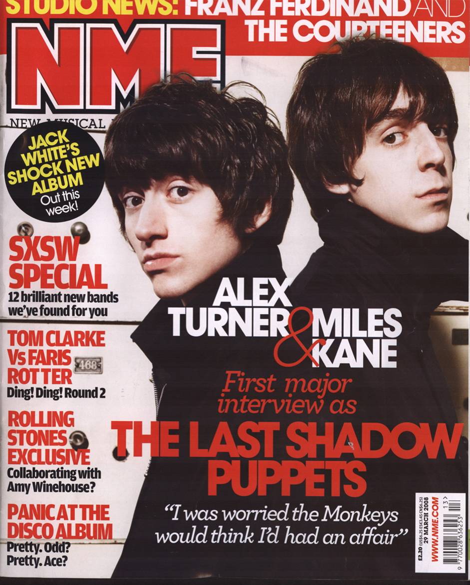
Masthead: NME – Brand name, well recognized music magazine Red, white and black coloured font (colours normally associated with music magazines).
Main Coverline: “The Last Shadow Puppet”. Links into the main image which is a photo of both band members (Alex Turner & Miles Kane).
Main Image: Both people are dressed to look as though they are in a band, or how people perceive these types of people to look for this specific genre of music. Photo is a low angle medium studio shot, which creates a connection to the audience and the main image, allowing them to identify with the type of genre portrayed.
Pug – promotion for Album, form of titillation.
Coverlines: Other supplementary information comparative to either the main coverline or music associated with this type of genre portrayed in the main image.
 |
Main Coverline/ Coverlines: There doesn't appear to be a main coverline, just a lot of coverlines, which could signify how all the stories are equally important, however certain coverlines and larger and bolder.
 |
Masthead: Vogue.It entices
the reader by drawing in their attention. Because of the mastheads familiarity
and affluence associated with it, the word, font and size of the masthead has
become well known. The masthead is well known so they use an actress (main image) who is equally as well known to draw in more readers. As well as this, since the title is covered slightly by the actress it shows that the magazine is well established and just as well known as her, if not more so, so it doesn't need to be seen. The layout is also well known, so people will know what the magazine is, even if the title is hidden.
Main Image and Main Coverline: "Holiday Romance" the colours used are eye catching yet nonchalant. The red dress she wears relates to both Christmas and passion, which reflects on the main coverline. The actress in the main image shows confidence and portrays sex appeal and beauty. This may make other woman want to buy the magazine so they can be like her.
Coverlines: May appeal to woman who don't have a lot of money and can "Invest" in something that may not cost a lot but still make them feel as if they've spent a lot of money.
|
Subscribe to:
Comments (Atom)