YayBlogger.com
BLOGGER TEMPLATES

Thursday, 2 May 2013

Evaluation Question 7


Looking back at your preliminary task, what do you feel you have learnt in the progression from it to the full production?


I feel like I have learned a great deal over the last few months whilst creating my final product. During the beginning of my research I learned a lot about the codes and conventions of a music magazine as well as what makes a music magazine stand out from the others. The first set task we did was to analysis a music magazine of our choice. I feel that during the beginning of the year I struggled to understand just how much I needed to do and what to focus on. However now I feel like I have progressed and because of this I feel that my music magazine is better than it would have been. Through my research I have also learned about colour schemes and how people perceive different magazines and make assumptions based on their appearance. I feel that since then I have been able to make connections between different types of music genres and magazines that are associated with them. During my preliminary task I ignored things such as web pages, page numbers and effective coverlines. However since then I have used all of these effectively as well as things like features and promotional advertisements in my final media product. Since my preliminary task I have also learned about the readers of magazines and how depending on their age, education and affluence their taste in music or magazines differs, so a magazine has to take this into account and addresses their audience in different but effective ways.
Another thing I have learned since my preliminary task is a
bout the mise-en-scene and editing used in a
magazine and how depending on the genre of music the setting, costumes or even the font of the magazine differs.
Overall I think I have improved greatly since my preliminary task. I have learned how to use different softwares, how to take photos, how to edit my work and learned about the different kinds of conventions associated with a music magazine. 

Evaluation Question 6

What have you learnt about technologies from the process of constructing this product? 

 Through my construction of my media product I have had to use many different software’s, which I had previously never used before. 

The first thing we had to use was Blogger; an interactive, independent blog which we would use to post our coursework. Blogger is simple and effective in the sense that anyone could use it. It has helped me to branch out of my comfort zone and begin to use the Internet more freely to publish research and not have to worry about where I put it. 


 The next software we used was Adobe Indesign. We had to use this to construct our front page, double page spread and our contents page. A problem I found with Adobe Indesign was that during the beginning of my production I didn’t know how to use the program. But after many demonstrations I have learned how to use it. I have also learned how to edit, change the contrast, filter and backgrounds of images through my use of Adobe Photoshop. I found Adobe Photoshop harder to use than Indesign though that was only because of the complex layout of Photoshop. However by the end of my product I have learned how to use it effectively.


Prezi is another software we had to use. Prezi is an online presentation software, which we could choose to use to help present our evaluation. By using Prezi I have learned how to effectively present information. 


 As well as these I have also learned how to use cameras correctly and efficiently, as well as learning which angles work best when designing a music magazine.

Evaluation Question 4


Who would be the audience for your media product?

During the development of my media product my target audience was set to be between the ages of 18 and 25. The type of audience I wanted were people who enjoyed listening to grunge music or had nostalgia for classic 80’s grunge. In my mission statement I said:

“My target audience will be teenagers to early adults as this is a similar age range to common music magazines such as Kerrang! It will however appeal to an older generation of music lovers as well”

The key demographic for my music magazine was exclusively to appeal to males between the ages of 19 and 25, however after research and through a quantative and qualitative survey my views on the audience changed as the results showed that girls between the ages of 17 – 22 also liked grunge. Originally I had chosen males as my main audience as my perception of people who enjoyed grunge was only males however after I’d received my results I soon edited my media product to accommodate to my new audience.

Due to the age I had chosen my media product reflected on the attitudes and social conventions of the different social groups. My media product accommodated different needs normally found in a media product through its writing style, the music that was selected and the images chosen. Due to the ever growing social networks such as Facebook, Twitter and Tumblr
and influence of the internet, which my key demographic uses regularly, I chose to incorporate the sharing of information that is used on the internet and use it in my media project to share information about up and coming gigs.

I feel that my magazine is a representation of my target audience as the images portrayed in my magazine relate to the audience it’s supposed to target in terms of their posing and clothing brands. The brands of the clothes are items in which the audience is used to seeing and may wear it themselves so it gives them a sense of being similar to the musicians. An example of this is the lead singers shirt which is a "Hype" shirt, which is a well known brand associated with grunge music and alternative bands.
The models hair is similar to the audiences own preferences and style as it mimic’s other well known band members which they may listen to or admire.


The masthead “GRUNGE” used for my magazine stands out and relates to the audience who would read it and associate it with the music genre. The title is bold and different to other music magazines as it’s something that hasn’t been done before, so the audience would want to read it.  

Wednesday, 1 May 2013

Evaluation Question 3


What kind of media institution might distribute your media product and why?


If my media product were to be real I would use Bauer to publish my magazine. The reasons for choosing Bauer is that it is multinational company that operates in 15 countries worldwide and they are the largest privately owned publishers in Europe. Statistically speaking, Bauer circulates 38 million magazines a week worldwide. Because of their success I would want Bauer to distribute my media product. As well as this their affluence and recognition could help my product become more successful than I may have thought possible.
Bauer also uses cross-media platforms; an example of this is Kiss radio, which promotes bands that, Bauer, owns as well as advertising other products too. Bauer also has TV channels dedicated to music and uses the Internet as a way of allowing the reader to become more interactive. This supports my decision to allow Bauer to distribute my magazine.
There are other publication I could go with, such as IPC Media, Imagine Publishing and Warner’s Group Publications however Bauer has better known magazines than the other publications and
is more established.
A problem with using Bauer is that there aren’t as many Grunge magazines in publication and the only other similar one would be Kerrang! Which is also owned by Bauer, so there might be competition or Bauer might be reluctant to publish my magazine because of its similarities with Kerrang!.   


Evaluative Question 2


How does your media product represent particular social groups?

My media project’s aim was to appeal to a certain social group, specifically between the ages of 16 -25 years of age. In setting this target audience I feel that I have met the required specifications in order to appeal to this audience in different ways.

My front cover was designed to appeal to my target audience through the use of its dark yet bold colour layout, similarly to Kerrang!’s colour format, as well as its informal writing style. As well as this I made sure that my front cover was focused on things, which were relatable to the people who would read the magazine, such as specific bands, clothing and events. The clothing worn by my models and the poses they did shows the relaxed nature of the band, as well as appealing to my target social group, which was grunge and alternative music lovers. Through my research into my target social group I had found that people who listened to grunge music tend to wear thrift store clothing to represent their separation from conventional and mainstream clothing. This helped me to style my models in a way which my target audience would find relatable and allowed my media product to represent the type of music and its audience.

In my article the representation of the social group was portrayed through the main image and subsidiary images as well as the article itself. An example of this in my article is the way the answers are written, as its relaxed and humorous tone makes it easy to read and represents the age of the singer. This allows it to be relatable to my audience as well as inspirational. The article represents the social group as the band itself became famous through the Internet, which is a reflection on today’s youth as being more interactive and involved with different media formats and technologies. This idea that they became famous through the Internet is more common among bands today with the likes of You Me At Six and The Blackout becoming famous through online videos. Magazines such as Kerrang! And Metal Hammer focus on bands like these and promote them, which is what I’ve tried to do through my magazine. The images used in the double page spread reflects on the social group as being enthusiastic about music through their poses, however their relaxed mannerisms reflects of the attitudes of the band and the audience. Their clothing again appears casual and is stereotypical of a grunge band.
 
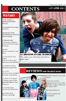
The contents page represents the social group through its images and portrays the band as being fun and enthusiastic. The titles in the contents page shows what people of my target social group want to read about and is a good social representation.

Evaluation Question 5